Anders Zorn Portrait DrawingPart 1 of 3 |
|||||||||||||||||
Drawing Portraits in a Painterly mannerCharcoal / Panpastel art lesson
Anders Zorn The chances are you are already well acquainted with the Swedish artist Anders Zorn. If you're not, then please feel free to take a look at our Zorn biography. Zorn and John Sargent were friends and rivals both painting in a similar manner. Once upon a time they both painted the same lady (Virginia Purdy Bacon), who let Sargent take a sneaky peek at Zorn's finished work. Sargent kept a tight lip, but reportedly returned to his painting, grabbed a nearby poker and destroyed it! Anders Zorn was nearly forgotten after his death, despite his popularity whilst living. The relative resurgence in his work highlights how artists disappear and pop back into the limelight. His limited palette and broad brushstroke style appeals to both the abstract and realist, though you have to see his paintings in person to fully appreciate this duplicity. Up close, the blocks of colour make no particular sense until you step back and appreciate the realism, economy of brush strokes and attention to edges. 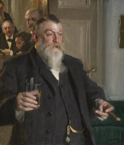 The Toast (A Toast in the Idun Society) depicts the archaeologist Hans Hildebrand, Axel Key , Carl Fredric Waern (industrialist / politician), Baron Nordenskjöld (explorer) and the main figure Harold Wieselgren, in Stockholm, gathered to celebrate the 30th anniversary of the Idun Society. I elected to create a study of Wieselgren from Zorn's oil painting in charcoal and pastel as an excuse to try out a Strathmore 500 Charcoal pad and a wolff carbon pencil which are both new to me. 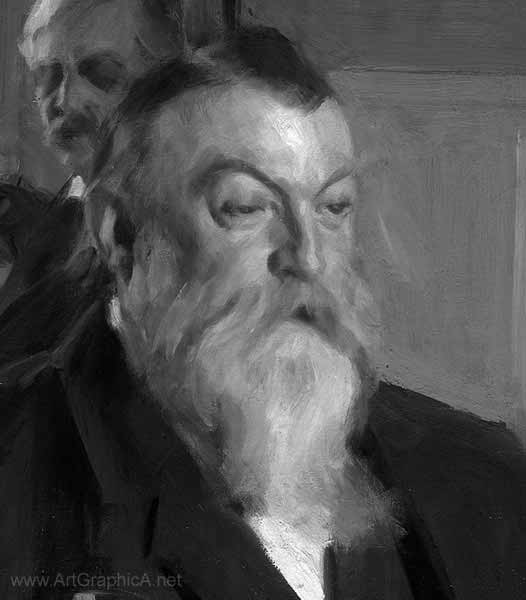 I have converted the image to black and white and raised the contrasts a little for emphasise as there is no colour to play with. Materials 
Plan of Action Even if conducting a sketch or study such as this, it pays to mentally plan how you are going to tackle it. My approach varies from drawing to drawing. I'm a big fan of Andrew Loomis' books which have all been republished at sensible prices. You do not have to be an illustrator or like Loomis' work (which is largely very dated) to profit from his teachings. They are the sort of books to read whilst practicing and to return to again and again. When drawing heads or figures I sometimes adopt the Loomis approach to head construction, which is very useful if inventing or drawing at a slightly unusual angle or perspective. You might also consider sight size (something I have never attempted), which is a more academic approach to accurate drawing. I've always gone for a relative size approach. For example if you started with a nose or an eye, then you build everything relative to your starting points. For better or worse I haven't the patience for laborious academic approaches. I try to work fast for the sake of spontaneity; I generally favour sketches over finished pieces of work, but never-the-less there still has to be some methodology and some checking of the drawing if it's to maintain any integrity. The Strathmore paper is textured to hold the charcoal, and has a nice soft, creamy off-white colour. I hope to use a full range of values from the relative-white of the paper to the black of the panpastel pure powdered pigment. The charcoal and pastel should sit as a happy medium between drawing and painting, allowing for easier rendering of values (certainly with the exclusion of colour) and allows the softening of edges to make the drawing more painterly (painterly simply means you are dealing more with values and transitions and not with edges and lines). When taking this approach to drawing you have to stop thinking in terms of lines and details and focus on masses. Squint and look at the shapes (Zorn has done the easy work for us), and simplify. Never get yourself bogged down in details, and certainly not until the end of a drawing. When you reach the end, you'll often find all that is required is a little dark accent here, or a light accent there, and just a few slightly sharper edges to create focus.
I start with a very simple line drawing with the vine charcoal stick. It's beneficial in two ways: firstly it's dark, so your lines are committed. Secondly, and in contradiction to my first point, the lines aren't actually committed because a simple wipe from a finger or putty eraser, and the line's gone! I started the head with a very light rectangular box which doesn't appear to even be visible in the photograph. The rest is just straight lines made relative to one another. I used to start with eyes, but now I begin with noses, and then put the eye sockets into place. Nothing here is sacrosanct at all - the drawing can be changed at almost any time, thanks to the malleability of charcoal. 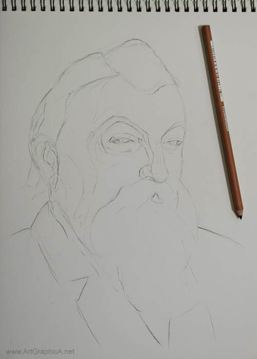 WOLFF's CARBON PENCIL In the next stage I was eager to try my Wolff's carbon pencil. Ordinarily I would take a craft knife and sharpen the pencils, but I quite like the little point it has when they first come out of the packet. It does seem to sit somewhere between charcoal and pencil, making a nice rich dark line, although not as dark as the charcoal pencils. I refined the drawing, in hindsight adding more detail than is necessary at this stage. As dark as the lines may look, they will inevitably get lost and buried and the features tend to get redrawn several times so there is little point labouring over details.
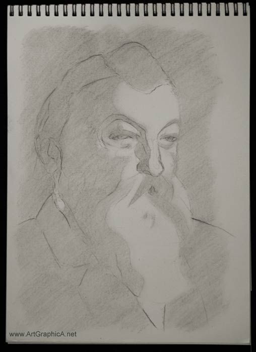
Whilst I could go straight into rendering values, separating shadow and light helps make the design stronger and future values are easier to judge. Looking at the source, I squint and try to reduce all values to either light or shadow, then draw the boundary with the vine charcoal. 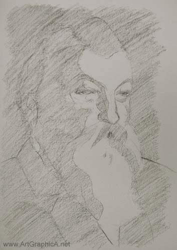 I'm not usually one for nice pretty shading, so the strokes (made with the vine charcoal stick) are backwards and forwards, but follow the same diagonal direction and stay within the boundaries I created in the last stage. Using a tissue I smooth out the charcoal pushing it (with a light touch) into the texture of the Strathmore charcoal paper. This generally lightens the tone, though by how much, depends upon the paper. Another unknown was how resilient the Wolff's carbon would prove to be, but it held fast and my drawing was still visible as shown. 
Lesson continues... Click below to see part two. Click to View PART TWO of ANDERS ZORN PORTRAIT DRAWING
|
|||||||||||||||||
Charcoal Lessons
Charcoal |
 The portrait drawing (on your left) is approximately 8in by 10in executed in charcoal and pastel in a painterly manner after the artist Anders Zorn. We will go through the stages involved in creating a study like this, but first a brief introduction to one of Sweden's most famous artist.
 DRAWING
 SHADOW AND LIGHT