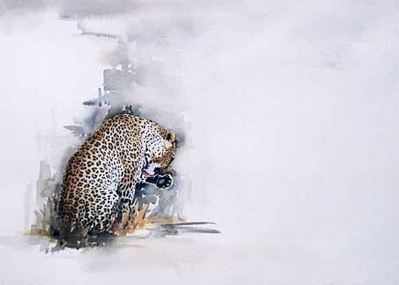
Leopard Wildlife Watercolour Tutorial"Good Grooming" free art demonstration |
|||||||||||||||||||||||||||||||
EQUIPMENT 1. PAPER - Stretched sheet of watercolour paper (mine is Saunders Waterford 300g Rough Surface). 2. PAINT - Winsor & Newton Artists' Watercolour tubes - Cadmium Yellow, Cerulean Blue, Burnt Umber, Blue Black, Quinacridone Gold. Lukas Artist's Watercolour tubes - Geranium Lake Bluish (a vivid, clean bright pink), Payne's Grey. 3. BRUSHES - Cotman 00; one inch, half inch, quarter inch flat. 4. MASKING FLUID 5. ERASER 6. PENCIL - Very sharp B COMPOSITION - PLACEMENT ON THE PAGE
The placement of these images on the page is very important. Their simplicity is their strength but they are not randomly placed. The ancient Greeks were probably the first to use a geometric calculation known as the "Golden Mean" or "Golden Section". I'll go into this in more detail in a future demo, but for now, suffice to say that the empty space is just as important to the finished result as the painted animal. Good composition is a vital part of the planning for a watercolour painting. Unlike many other painting mediums, watercolour can't be painted over and is very difficult to remove once it has been put onto the page. So planning is essential. DRAWINGI believe that the drawing for a watercolour painting should take longer than the actual painting. I draw in an entirely different way when drawing for a watercolour painting (as opposed to drawing for drawing's sake). 
All the visual information is stripped to its basic shape. Instead of seeing identifiable objects (e.g. "eye", "ear", "paw"), I look for the shapes which are created by light, colour and contour. Most often, these shapes do not have a name - they are simply shapes. The result is a "paint-by-numbers" type drawing, with no tones shaded in. Instead, tones are indicated as an enclosed shape. In areas where there is a gradual shift in tone, rather than a hard edge, I will still indicate this shift by an enclosed shape, but will draw it in more lightly. If you look very carefully at the drawing (left), you will see these meandering lines on the leopard's haunches. Can you see why it is so important to use a SHARP pencil? By putting in a lot of information at the drawing stage, I am able to be more loose in my handling of the paint. I remove any pencil lines which I do not need. I draw quite faintly so that I can remove drawing lines when I have finished painting. For some reason, it seems to be more difficult to remove pencil from areas that contain yellow - so be especially careful about unwanted pencil lines in these areas. Then I use masking fluid to mask out areas which must remain white or light - such as the leopard's whiskers. For more information about masking fluid, see Demo 2. THE FIRST LAYER
Using a mixture of Cadmium Yellow and Geranium Lake Bluish, with a tiny amount of Cerulean Blue added, I paint the first layer. This is a basic mix of the three "primary" colours. I will go into colour in more detail in a future demo. I do not mix a vast lake of the required colour, preferring to mix as I paint so that even at this first stage, there is variation in colour. By mixing a little of the three basic colours at a time, I am also forced to work faster, so there is less time for fiddling. I also use the same colour mix in the grass. There is also a variation in tone in this first layer, which is achieved by putting down a wash, then gently softening too-hard edges by dragging through the wet wash with a clean, damp brush. NOT wet, as this will cause backruns. Then I allow this first layer to dry. THE SECOND LAYER
Almost invariably, I will need to make the first layer darker. Watercolour always dries lighter, so now I will add another wash of the same 3 colours, darkening as necessary. Can you see how, in some areas, the leopard's colour is "warmer" or "cooler"? This is as a result of adding slightly more pink in the "warm" areas, and slightly more blue in the "cool" areas. I also paint the "inside" of the leopard's spots the rosettes which are formed by a cluster of black spots. These are darker along the leopard's back and here I will use some Burnt Umber. Touches of Burnt Umber are also used in area's of the leopard's face. THE COOLS
Once the second layer is completely dry, I add a very diluted wash of cerulean blue in the shadow areas of the leopard's body. This blue layer can look alarmingly strong, but once the leopard's spots are added, the blue almost disappears. This cool layer is also used to indicate the leopard's form - bearing in mind that cool colours tend to recede, while warm colours tend to advance. Then touches of warm Quinacridone Gold are added on the leopard's back and in the grass.
|
|||||||||||||||||||||||||||||||
ART LESSONS / ART BOOKS |
|||
| FREE ART BOOKS Beginners |
WATERCOLOR ART Drybrush |
WATERCOLOR Portrait |
|
 |
 |
 |
|
| WATERCOLOR Dog |
WATERCOLOR DEMO Utah River |
WATERCOLOR Leopard |
|
 |
 |
 |
|
Watercolor Lessons
|


 By
By 

