A Pastel DemonstrationLandscape Painting Art Lesson |
|||||||||||||||||||||||
Early Morning in the Smokies

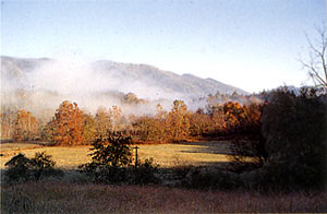
This scene [at left], which I photographed for reference in painting it, was selected because of the compositional balance, strong contrast between sunlight and shadow, distinct pattern, contrasts in color, value, texture, and content. I thought it was beautiful and was mesmerized by all the elements of nature presented at the same time. The Great Smoky Mountains, part of the Appalachians, are remarkable for their great variety of flora, which I was eager to interpret in pastel. 
Step 1. For my beginning diagram I draw simple shapes to position all the large and medium-sized components in the picture plane, using a light outline in a neutral-colored pastel stick (NuPastel #283 Van Dyke Brown) sharpened to a point. These temporary outlines will be revised many times during this preliminary stage. Once general areas are established, I can evaluate shapes and placement and make composition corrections before going on to the next step. 
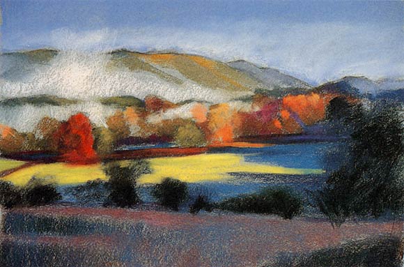
Step 2. To decide which colors I'll underpaint first, I squint my eyes while looking at the scene I've selected, then block in some of the dominant dark masses that I see, using the side of the pastel stick. Working from dark to light is standard procedure with opaque pastel colors. Squinting helps to eliminate specific components and details, thereby letting me view color and value in their simplest forms. In this underpainting stage, I make no attempt to create volume, light, or depth. I recommend that you establish your primary color value a little darker than it actually is. This approach will produce a richer contrast basis for lighter revisions. The only exception to this rule is that the very darkest colors should be made slightly lighter to allow for the final use of black when revisions in deep shadows are made in later stages. 
Step 3. Continuing my color block-in with smaller, more concentrated patches of pigment, I use a combination of hard and soft pastels, saving soft ones for last. I'm not worried that I might be choosing a "wrong" color. At this early stage, just try to get in the "ballpark" with colors; you can change them later as often as needed. 
Step 4. Now working on all sections of the composition, I revise for good values, colors, and intensities while taking care to retain clear divisions between lights and darks. Almost 90 percent of the strokes were produced by using the flat sides of pastel sticks. Applying light strokes to "test" the calligraphy first, I continued to search for the right combination, making sure to keep the statement general. Specifics will happen in later stages. 
Step 5. Blocking in the lightest lights, at this point I make my first evaluation of overall color relationships. Whatever simple revisions need to be made, now is the time to make the foundation changes. I'm also refining the contours of individual shapes, solidifying the colors, and suppressing some of the brighter colors in the background by adding their respective complements to "gray" them down and make them recede.

Step 6. There comes a time in every painting when you have to set the stage in one area in order to create a contrast for the remaining areas. I'm working on the background trying to soften and neutralize colors and subdue and eliminate contours to make these areas recede. At the same time, I'm trying to create the soft essence of the ephemeral cloud formations that typify the Smoky Mountains in the early morning light. Once I'm somewhat satisfied with this look, I'll start working on the transitions in the sunlit middle section before focusing on the intricacies of the foreground. 
Step 7. Evident texture (rough) has a tendency to advance in a picture plane. I've rubbed the cloud and sky formations to eliminate such texture and create a solid base. I've also added more layers of color to the sky and clouds to reestablish the beauty of pastel rather than allowing the rubbed surface to be the visual one. 
Middle-ground detail. I've placed many layers of color one on top of another attempting to find what I think is the best combination for this section. It's not unusual for me to revise an area four or five times until I'm satisfied. I wanted the colors to integrate and create the illusion of clouds and tree line. Wiping my pastel stick clean before applying each stroke helps to keep my color clean and sparkling. 
Step 8. After the pattern within the middle-ground shadow is established, I work from background to foreground, overlapping as the movement to the front continues. The directness of the final calligrapic strokes produces the pronounced contrast so necessary for establishing a foreground. 
Step 9. Further development of the foreground is shown here. It was important to work on this area to gain control and a feeling for what I'm trying to create. As you can see, the depth in the composition is becoming quite obvious as I continue to work on spatial clues. Not yet finished, I wanted to see what everything looked like after the next stage of developing the trees and bushes overlapping the middle ground. 
Foreground detail. In this close-up, observe the vitality produced by having many strokes integrated into the foreground foundation, while other strokes seem to sit on top. 
Foreground detail. Bushes and trees were developed only after I was somewhat satisfied with the middle ground. These items are established as overlapping forms and made with calligraphic strokes. I want the marks to function with every stroke as I near completion of this landscape. 
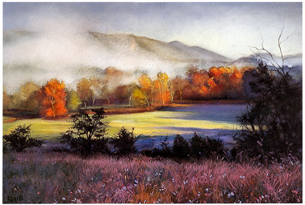
Step 10. At this completion stage, I feel I've captured both the feeling of light and the emotions I felt when looking out the window of the farmhouse from which I first saw this view. Technically, I selected colors available in my various sets to approximate my artistic vision. The last strokes were made with the very soft Schmincke pastels, after which I applied a coat of workable fixative. Early Morning in the SmokiesPastel on Paper, 18" x 24" (45.7 x 69.9 cm)
|
|||||||||||||||||||||||
Painting with Pastel
Art Lessons Online |


