Photorealism. Glazing and Grisaille TechniquesOil Painting Lesson |
||||||||||||||||
Purple Iris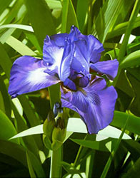
When am I going to "settle down", and paint one kind of subject? Probably never, I'll have to admit. It is more interesting painting various subjects. Here's one that I began, working from a reference photo that I took of an iris, at an "iris farm" that was having a sell-out auction, earlier this year, here in the area. Once more, I decided to first apply several coats of Grumbacher 525 Acrylic Gesso, to an already acrylic-primed Fredrix canvas. I sanded the store-bought surface throroughly first, and applied several (4 or 5) coats of my acrylic primer, sanding between each coat, and after the last. Grumbacher Acrylic Gesso 525 has marble dust in it (calcium carbonate, as it is now called). It makes for a very porous and non-slick (shiny) surface. I sand the store-bought canvas thoroughly, before applying any of my acrylic primer. Then I apply as many as 6 or 7 coats of the Grumbacher primer, sanding quite throroughly between coats, with 150 grit aluminum oxide, open coat sandpaper. It makes it smooth, to the extent that it eliminates the canvas weave. It does not eliminate any brush strokes. (There actually are no brush strokes to eliminate.) You can stop applying the extra acrylic primer at any time, and thus leave as much of the canvas weave as you care to have. The Grumbacher gesso is as thick as mayonnaise, in the container. It must be thinned with water, in order to be brushable. I add enough water, and stir it with a putty knife so that it is the consistency of whipping cream (before it is whipped. ) If you should mix it a bit too thin, simply apply more coats. sanding between each one. I coated the entire primed, dried, sanded, and dusted canvas with an imprimatura, consisting of equal parts Burnt Sienna and Raw Sienna, using enough Permalba White to make it a bit opaque. The reason that I use Permalba White in the beginning layers is not for its drying characteristics, but for its opacity. Permalba is a combination of titanium and zinc whites. The titanium is more opaque than the Flake White (lead and zinc white), which I use later. I feel that the pigment of the Permalba White mixes more aggressively with my Umber/Black mix of paint, to form the tones that I need for my grisaille a bit easier and quicker, than do the more subtle, less aggressive properties of Old Holland's Flake White, that I use on the later layers. I mix enough medium into the beginning layers of paint, to far offset any possible effect of the slower drying tendencies of the safflower vehicle in Permalba. My first layer(s), mixed with my lean medium, usually dries overnight. The lean medium is about 1 part stand oil to 5 parts turpentine. That actually dries quite fast, and certainly faster than my fatter medium (the "medium" verson) of 1 part linseed to 2 parts turpentine. I seldom get overly concerned regarding the drying characteristics of either pigments, brands, or vehicles (binders). If I were adding driers to my mediums, I'd probably make it more of a science, but I have had no trouble, simply mixing my lean, medium, and fat versions of linseed and turpentine mediums. And, I often mix the next version of my lean-medium-fat medium mixtures right on top of whatever is left in the bottle from the last one. It really is not rocket science, and need not be held in quite that high a regard. I find the fat over lean requirements to not be that exacting or demanding. I never get concerned regarding the drying characteristics of vehicles in various brands of paint, or with various pigments within any single brand. If I were that concerned, I would never use Winsor & Newton paint under Grumbacher paint, as the vehicle in W & N is a combination of linseed and safflower oil, and that in Grumbacher is entirely linseed oil. But, in practical application, I mix 'em up, all the time. After gridding a 16" x 20" sheet of tracing paper, I drew the image onto the tracing paper, using a similar gridded version of my original photo, which I gridded in Photoshop. Turning the tracing paper upside down, I drew over each pencil line of the image with a stick of soft vine charcoal. I did this on a light colored table top, so I could see the lines from the front side through the tracing paper. 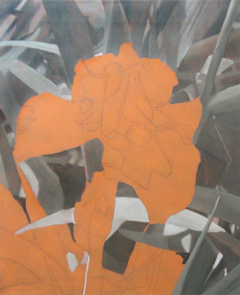
Flipping the tracing paper back to a face-up orientation, I placed the charcoal side against the oil imprimatura on the surface of the canvas. Using a ballpoint pen, I transferred the charcoal to the freshly dried surface of my imprimatura-coated canvas. I lifted the tracing paper when finished transferring my image, and lightly "dusted" the surface with a paper towel, to remove excess charcoal. I began my grisaille underpainting, using a mix of equal parts Raw Umber and Ivory Black, with enough Permalba White to create all the required tones. I work from a grayscaled 8" x 10" reference Photo of my subject, which I created in Photoshop. This first example shows the imprimatura with the charcoal lines, and the beginning of my grisaille underpainting. It is not necessary to complete a grisaille underpainting in one session. I usually spend as much time, and apply as many layers as I feel necessary to provide myself with an accurate "tonal map" of my subject. This makes it much easier when the time comes to apply color layers. Using a medium consisting of 1 part linseed to 5 parts turpentine (a lean mixture), I applied two or three layers, in the creation of this grisaille. I did this in several sessions. 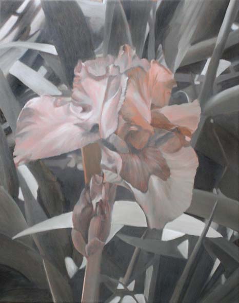
This photo shows the result, after one grisaille layer over the entire image, and an extra grisaille layer over the background area (the leaves). The "pinkness" of the flower is because a bit of the imprimatura is still showing through. It seems to be working out fairly well for me, so far. Grisaille underpaintings always seem to help out so well, in my scenario of painting techniques, that I always like sharing the experience with others. When I began painting in oils, I often would get near the completion of my painting, and tell myself that if only I had realized early on, how good the painting was going to look, I'd have taken even more care with the first layers. Well, not any more. The grisaille underlayer has provided quite a sound beginning, and I find myself enjoying the process of creating it to such an extent, that I actually find myself taking the care that I should in producing it. Here's the next installment of the underpainting--the completed grisaille--two or three layers of grisaille, in some areas, and each one, using the lean medium: 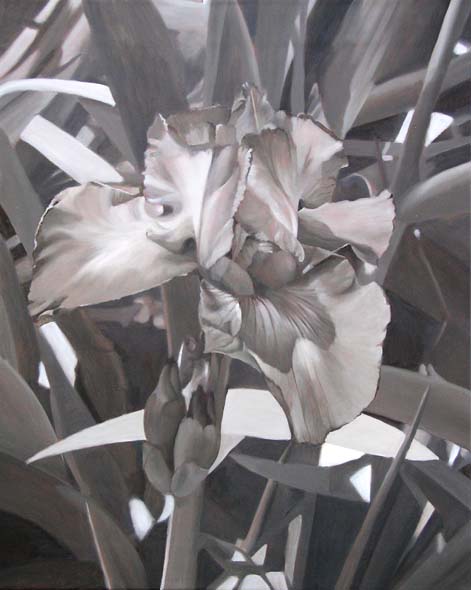
I am working from a grayscaled reference photo. When the grisaille is completed, I then switch to my color photo reference. When I make my grayscaled (actually "desaturated") image in Photoshop, I generally lighten it a bit, and flatten it a bit, so I get a lighter and flatter grisaille. In Photoshop, I also am able to skew the color of my reference to nearly match the Raw Umber/Ivory Black that I mix for my grisaille. That's the reason I use "desaturate" instead of "grayscale". ("Desaturate" makes it gray, while retaining the ability to control colors.) Flower paintings always seem to get juried, and sell well at the local art competition that I enter each year, so I just thought I'd cater to that "trend", and have one ready for next year. In this dry a climate, my lean medium that I use for grisaille painting usually dries within 24 hours. I can nearly always paint every day. I try to keep my grisaille underpainting quite thin. Even where thicker (such as the lighter areas), I try not to leave any brush strokes. After completing a moderate size area, I use a clean, dry, 1" or 1 1/2" sable brush, and rather beat the heck out of the freshly applied paint. This knocks down any unwanted impasto, and helps to soften the edges. It is a process that is often termed, "flogging", for obvious reasons. They sell outrageous looking brushes, called "flogging brushes" made for this application. They look rather like a super-long-bristled whisk broom. I never knew what their use was, until I found out about the process. The appearance of the brushes, makes sense to me, now. I don't get into the procedure to quite this extent, but any soft, clean, dry brush seems suitable for the extent that I use it for this purpose. The procedure seems to work quite well. 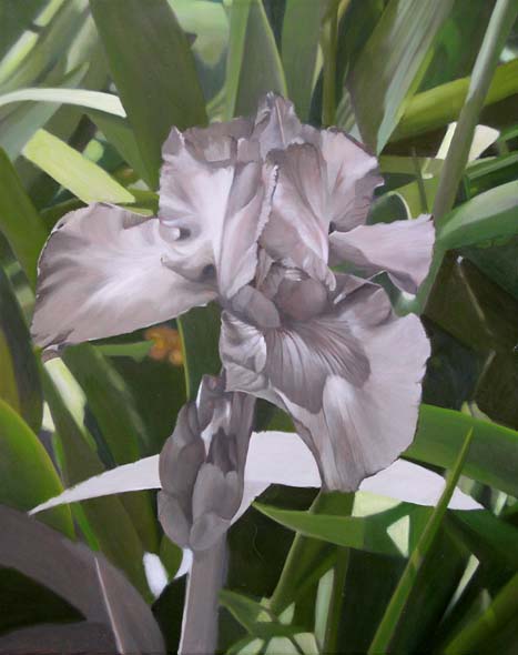
This next progress shot shows the beginning of a color layer. I am applying the color perhaps a bit thicker/more opaque than with a "normal" first glaze layer, but variety is the spice of lfe, isn't it? Actually, because of the "opacity" of this subject (a flower and leaves), compared to a subject requiring a bit more "transparency", such as fruit, I felt that a more opaque first color layer might be appropriate. As many of you know, I mix my own greens. In this case, I used a combination of Ultramarine Blue Deep, Prussian Blue, Cadmium Yellow Light, Cadmium Yellow Deep, Burnt Umber, and Ivory black--all Grumbacher Pretested Oil Paint. My white is Old Holland Flake White (lead and zinc). In this part of the painting, I'm simply creating abstract shapes, by evaluating my work against the color reference photo. I'm paying very little attention to whether I'm making "leaves" or "stalks", but simply putting shapes and colors where they're located in the reference photo. The flower area is not truly "pink", but only appears to be so, because of the surrounding green of the background. It's a "bluer pink" because the green of which it is a complement is a "yellower green" (Magenta is the complement of green.....blue (or "violet" if you prefer) is the complement of yellow.)--one of the "mysterious" attributes of color that I've dealt with for many years in the litho trade. In glazing the first "purple" color on this flower, I'm using a combination of Ultramarine Blue Deep, and Permanent Rose. In my opinion, W&N's Permanent Rose is quite close to magenta. It is interesting that, although I own, and have on my palette, Dioxazine Purple, I am finding I like my mix of Ultramarine Blue and Permanent Rose even better for the most part. Wherever I need dark, more neutral shadows for this violet/purple, I simply use Cadmium Red Deep, instead of Permanent Rose for the mix with Ultramarine Blue. It is dirtier, and has more yellow in it--therefore, it creates a darker, more neutral violet. This flower appears a bit flat, right now, but that's the effect of the first glazing of color. After a layer or two, I will begin applying more light colors and whites. Here is the flower, with its first color glaze: 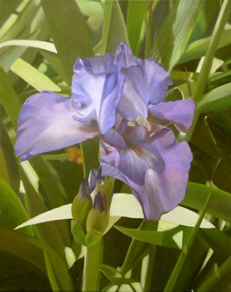
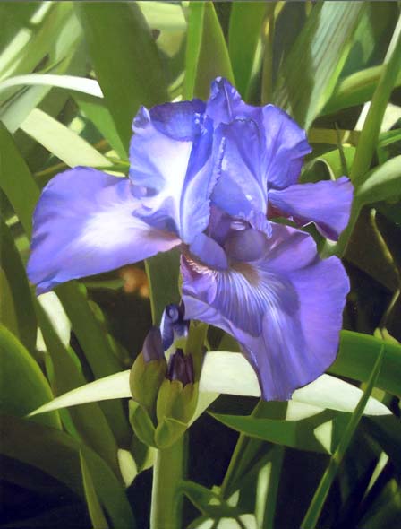
It is interesting, because I painted the background by only paying attention to the shapes, tones, and colors--in a rather abstract viewing attitude. When I first stepped back and witnessed the actual leaves and stems I had created by doing that, I was actually quite happily surprised, myself. That is one reason I believe that the word, "abstract", needs to be a part of every painter's vocabulary--even the realist painter. Here it is, after more major additions to the flower, itself, and quite a bit more tone/color tweaking to the background. The background needs to be a bit yellower in the green. I have determined this, because as I color correct my photo, prior to posting it in this thread, I made it yellower at times, and it appears quite improved with that sort of a tweak, so I believe I'll slowly and deliberately, begin "yellowing-up" my greens in the background. I already have, somewhat. I have painted nearly all the layers of this painting with a "medium" mix of my oil/turpentine medium. I observe the fat over lean principle in my own loose fashion. For example, when I began the grisaille on this painting, I had some leftover "medium" recipe version remaining in my little medium bottle. I mixed a "lean" mix, and did so right in the same bottle with that remaining mixture. Then, when that mix was getting a little low, I mixed a bit of the "medium" recipe, and, again, did it right in the same bottle as the remaining amount my "lean" mixture. This entire painting with its many layers, has nearly all been painted with one single medium. That medium has been a "fattened" version of a "lean" medium. Now that this "medium" mix is getting a bit low, I'll probably complete the layering of this painting by mixing a "fat" version right in with the remaining mix that is in the bottle already. I feel that it is perfectly acceptable to paint with one medium for the entire painting. (I do that all the time, when I paint a portrait. I use SP's Spray Medium for each layer, and truly have no idea just where it may lie on the fat/lean scale.)
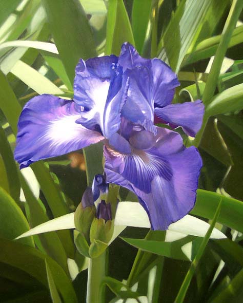
One way to make highlights, such as the whites on the flowers appear lighter, is to mix a small amount of the complementary color into the white. It has the effect of making it appear whiter than white, when viewed surrounded by violet and blue colors. I mixed a tiny bit of Cadmium Yellow Deep in with the Flake white, when painting the lighter parts of the flower. Here's my next progress, after a few more hours of work (RGB color, in the digital image is producing an image that is a bit brighter on the screen than the painting actually is. I had to color correct it in Photoshop, to dull it down a bit (especially the purples/blues), to make it appear more like the actual painting.: Here's the last, final result of my "Purple Iris", 16" x 20" oil on canvas. I have signed it. I do see a couple of little paint smears on the large leaf, behind the stem of the flower, but am fixing that as I speak. Thanks for lookin' in, and here's the final version, ready for varnishing and framing:  By William F. Martin
|
||||||||||||||||
Oil Painting Lessons
Art Lessons |
 Fat over fat is OK, as is lean over lean. However, I'm careful not to use any leaner mixture than the layer previous to it, when I am painting. A little bit "fatter" is fine for each subsequent layer (even it is only a LITTLE "fatter"), as is identical medium, but I avoid mixing any leaner, as I progress in my layering.


