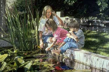
PRISMACOLOR, COLORED PENCIL ARTSummer Afternoon |
||||||||||||||||
Drawing with Prismacolor
1. Before applying the final drawing onto a larger drawing board, I had the client approve the composition and presentation of the children for their painting. Using a fine line technical pencil, I drew a ghostlike image onto a 24" x 36" 100% cotton, cold press Strathmore illustration board. The line drawing was rendered by lightly pressing the pencil lead onto the board using feather-like strokes. After the ghost lines were drawn, I spray-fixed the drawing to prevent smearing or rubbing of the drawing. When the line drawing was completed, I applied value and color with Prismacolor colored pencils. 
2. To separate light and dark values into shapes, I use a color native to the subject I am painting. Alternating between strengthening the light and dark values and the overlapping of colors, I work with very sharp points, sharpening them frequently for better control. The overlaying of colors and values is applied with straight or circular strokes. I apply delicate pressure on the drawing surface when painting flesh tones or other subjects that need care in the rendering. 
3. I continue to alternate color with value applications until a strong value contrast and rich color saturation is achieved. For blending all overlaid colors, the Prismacolor blender pencil (PC 1077) is very effective. The blending pencil was not available when I painted "Summer Afternoon," but I have found it to be valuable in my recent works. I use it to add finishing touches to delicate overlay applications or for burnishing techniques. 
4. I completed one section at a time in "Summer Afternoon," inviting my client over to view the work in progress. Often, for out-of-state or country clients, I photograph the artwork in stages and send them examples of each step, so they can see what progress I am making on their commission. 
5. The little boy pictured in "Summer Afternoon" is an example of the step-by-step process of alternating values with color using the overlay blending technique on skin tones, hair and clothing. I carry the overlaying process to a near burnished surface. An extreme burnish on a surface becomes slick, like drawing on glass. Because the texture is slick, changes to the completed surface are difficult to make. In portraiture, making subtle changes are imperative when the client wants an exact representation of likeness. I keep the surface mutable by overlaying the colors carefully with a sharp pencil, just on the brink of a burnish. (I do use heavy pressure to burnish on highlights and in extreme dark or rich areas of color for a special finish.) 
6. Following the same procedure of alternating light and dark values with color, I painted the retaining wall and water. 
7. The background is rendered by the same method of separating light and dark values, using the colors and values native to the environment. Solvents such as turpentine or a clear blending marker give a look like a burnished richness, but retains a workable surface. Note: Overlaid colors, burnished surfaces and solvent smeared colors can be lifted off the Strathmore 100% cotton, illustration boards and Bristol boards with an electric handheld eraser, and/or Exacto brand retractable pen knives. I use both the handheld electric eraser and retractable penknives as subtractive drawing tools - not just as a means of erasing. 
8. The rich, dark values in the background are worked with a Prismacolor Clear Blender PM-121. This is a marker impregnated with clear solvent. I worked the marker in circular motions over the dark colors in the leafy background. There are patches of the leafy background deliberately left out of the clear blending marker application to create a varied texture. These textured patches contrast with the smooth dark saturated patches of the colorless blending marker. Colored pencils can be worked over the solvent covered surface to lighten or darken values, or enliven the color. Solvents give the appearance of a burnished surface, but it remains workable. 
9. To make the reflective surface of the water contrast with the textured surface of the environment, I use the same color and value overlay application described previously, but employ a clear blending marker to create the shiny effect of water. By dragging the clear blending marker across the surface of the water in moderate horizontal strokes, the overlaid colors bleed together. Over the colorless marker marks, I blend and burnish the light sparkle of sunlight caught on the water with white and apply more colors and values over the solvent blend as needed. (Note: The technique of using liquid solvents, such as turpentine or distilled spirits, brushed over the wax colored pencil overlays is spontaneous and painterly. Controlled bleeds and blends are the advantage of using the clear blending marker. I use liquid solvents to dissolve and blend uncomplicated sections of color overlays to reduce the stippling effect of the paper grain.) 10. I finish the painting with a mat spray fixative. The fixative spray prevents wax bloom, enlivens the color and seals the painting.  Visit Sheri Doty Website Tutorial is copyright of Sheri Doty
| ||||||||||||||||
Drawing Lessons
Site Navigation |


