FANTASTY OIL PAINTING DEMONSTRATION |
||||||||||||||||
The Tranquil Sea - Part 2 of 2
Palette showing warm and cool neutralizing colors
This shot of my palette at this stage shows the freely mixed warm and cool tones (purple and blue with warm green and red earth hues loosely mixed with Liquin medium). The resulting 'grays' aren't flat and dead looking but have color and life. So when I coated this over the underpainted richer coloring of the blocked in sea, this helped to tone it down and give more of an effect of real fog rather than an airbrushed, too smooth mist, which says nothing. I tried to stick with my same two main larger brushes, the 1" flat sable or synthetic, and a 1-2" full, bristle filbert, then buffed the rough block-in of fog with a full mop brush and fans. An additional greenish gray layer went over this stage, not shown here, to further unify and soften the fog like atmosphere would in a sky distance. I could have kept going I suppose, layer upon layer, each done quickly but having to wait for the paint to thoroughly dry in between layers. In fact, you can paint a lot of atmospheric or solid effects this way- one the base, 2nd layer the shadow, 3rd- the fading or similar effect, and on and on. It takes a bit of planning and helps to know if you don't get what you want you can always paint over it with heavy paint , or sand it off, then start over. It takes some patience so don't get frustrated with no immediate results, the effects can be worth it.  Fog blocked in - 1st stage Fog blocked in - 1st stage Fog smeared around over dry paint underneath Fog smeared around over dry paint underneath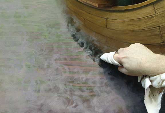 Cleaning up the fog with a new lint free rag 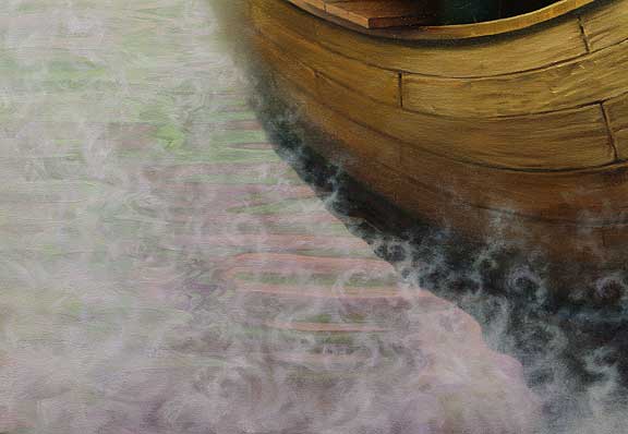 Fog softened by fan and mop brushes before final  Darkened rower
 scraping paint
Above, I am scraping off an occasional stubborn area of initial heavy paint that's dried and is in the way of my revised drawing and passage of color. Whenever I plan to change something, I certainly don't want to fight heavy paint. As much as I Iike the look of it, its really more for final strokes, not the foundation work. If you have a lot of buggers, impasto, or just brush strokes that stick up when dry, as I always do, if it stands out like a sore thumb then its got to go. You can sand it off or, faster, just take a good one sided razor and VERY CAREFULLY scratch at the offending area by scrapping over it a few times, making sure you don't twist the blade into the canvas itself so it doesn't pull and cut through it. Opaque paint will easily recover the area, but matching the paint there will be tricky so coat it with some oil or medium first for more accurate color matching. Now that its smooth it will be very easy to cover. You can see where artists like Sargent would change areas when he had a lengthy time between settings of portraits or just wanted to move things a bit.
Now, lets say I wanted the whole painting to have heavy impasto strokes from the start- the problem there is the only way to fix an area is to add even heavier paint and keep correcting as you go. I love that look but if you are doing inventive work, as opposed to seeing something you are painting and having that to guide you, then I suggest you stay away from the heavier passages and leave them for last. The main reason is its so hard to correct doing the kind of work I do, making up so much area that I don't want to have to fight a textural mess if I change the drawing or design. I can usually tell which artists have used direct reference and those rare ones who make up their work - the opaque, direct approach simply says they had something to look at. I think that's smart, but can also restrict creative flow that might have come into play otherwise, especially in so much contemporary work where the dependence on a model or strict photos leads to copied figures or landscapes etc that have less life to them and more of a classic schooled approach. While color is important, I am convinced that getting value right (the light or darkness of a hue) is more important in realism, and you can even get away with off color
You can see where artists like Sargent would change areas when he had a lengthy time between settings of portraits or just wanted to move things a bit. They really stand out and sometimes those areas look considerably weaker than the more fluid areas where he was more sure of what he wanted. Most of that doesn't show up in print (books) and seeing the originals can be a bit disappointing sometimes. I remember seeing John William Waterhouse's Lady of Shalott, a fairly large piece with some heavier passages of thick paint here and there. Through a contact I had, I was able to see it ahead of the crowds before the museum opened, and got close enough to see the area just at the front of the boat. It was so heavy with paint that it looked completely caked on and a real mess, like he wasn't sure what he wanted. This black mass of paint looked more like a huge patch than intentional and made me wonder if the painting's canvas had torn there and had been poorly or desperately reworked. Overall, of course, the painting was a pleasure to look at, but the craftsman in me kept going back to wonder at how that area got there. If you really want to find areas that are technically problematic, even in great work, you can if you look long enough I suppose. It can bring artists like Sargent down to a more human level. (I don't even like to look at my older work in that regard, I see all kinds of problems that I want to fix). But the overall impact of each work should be to see a piece that has content and feeling, and maybe the human-ness of its imperfections give each piece that much more character. After all, its one thing to criticise a piece after its done, but another to even attempt to do it. If an artist friend and I stood looking at a beautiful museum piece and one of us pointed out some area that we thought could have been painted better, we never forget the effort it took just to get the painting done and always look for the best parts to study and enjoy. You can learn from the problem areas, in other words, as well as the rest of it. Not to knock Waterhouse or Sargent, both great painters and two of my favorites, but you don't want to leave any viewer with the idea that the painting was not 'sure' or finished, if you can help it. This is much less obvious in more fluid, freely painted strokes or passages- and more obvious in smoother areas or more tightly controlled sections of the painting. You can often see imperfections in colormatching around the heads in portraiture, for example, as these areas are frequently painted at the 2nd setting, when the paint has dried and its necessary to match the background color. Color matching is a very tricky thing, especially when trying to work opaquely, and its worse when you try to paint an opaque passage into or over a transparent one, since the transparent paint has an inner 'glow' effect that's nearly impossible to match opaquely simply because of the way light bounces off to show its inner color. Opaque paint is more reflective, so its sometimes necessary to increase the color intensity to match the transparent color effect. Or do what I do, don't wash in the initial color areas and let them dry - but paint directly with opaque paint, then, when completely dry, you can enrich the color with a patina layer, or several layers, to give the illusion of a glazed effect much like Rembrandt or Whistler did in heavier areas. You can see some of that in the rocks I painted in this piece- lots of variations of grays but the real foundation or underpainting was solid, heavier paint, with a few colors dragged or tinted over to give the effect of many colors within a similar value range. While color is important, I am convinced that getting value right (the light or darkness of a hue) is more important in realism, and you can even get away with off color. In fact, I prefer it, as it gives the work a more interesting mix of overall color that the 'proper' color sometimes lacks. My tendency now is to work toward color variations of grays, a more sophisticated palette- I hope, than my earlier work where hotter color pulled the eye around everywhere instead of my control of placing elements and subtle color tonal shifts where I wanted them to catch the viewers eye and lead them into the work to the important areas. Its tricky and requires some forethought and I hope it comes off well here. Below, the board I use as a steady bridge, or support, is a 5 foot length of straight wood that I nailed to a top cross piece and it hangs from my easel's upper canvas support like a big t-square. Any solid wood should work, like a 2x4, something with some weight to it. I put thick tape all over it to keep from getting splinters. I rest the heel of my right hand on its flat face and it makes an ideal maul stick without my having to hold one for hours when working on smaller detailing. It also makes great straight lines and if you put two at both ends of your easel hanging down, you can put nails or screws in at 1" increments or so and place a dowel rod or any firm straight device between the two supports and get good horizontal lines as well as any degree of angle for doing long straight lined effects. I also built a quick pole of nails that I place the end of my maul stick on and use it as a pivot for getting easy true angles. Whatever works.  My maulstick bridge, T-square- used for detail areas  Figure near final before final glazed tints over whites Really heavy paint, or impasto, will crack in time simply due to the inherent properties of how it dries
The moment of truth. I suppose- I work on some pieces just to get to this point- take a look at the whites above then the warm, almost creamy color below. Monitors vary, but below is an accurate color shot of the final head. You can see where there was white, above, now there is a tinting of white to suggest a sun glow that you can't get any other way than with a patina. I can't say its a true glaze as that is worked over from a white ground, ala Parrish or Rembrandt. This is more of a light tinting of a few transparent colors directly over a heavier painted white- more like Whistler, although he tended to scrap off the effect and then redo it- going for the overall somber tones he is famous for and what makes some of his textural work look really cool up close. I can control my drawing by correction of the heavy paint (again, not impasto, but opaque and somewhat viscous without being heavy) and when I am ready, I can apply a more translucent coat, often using Liquin or other medium. If this paint had been really heavy, the patina or thin coat of color, would have set into the texture rather than stand above it. I like that effect, but it doesn't glow like the original does here and no book or monitor can really show how delicate oil paint can be. As an oil painter, you might want to familiarize yourself with those tube colors that are opaque and those that are 'transparent'. I have my favorites and, after many requests, have listed them on this site on the Technical Page. Many hues I like are a bit out of the ordinary and exceptional colors that I use specifically to warm up areas or tint with. They are generally listed as 'transparent' right on the tube label, but some work much better than others and brands vary. While I am on the subject, you don't have to limit yourself to thinking its got to be a light color tint over white base. You can darker tint any area that's lighter than the color beneath it and even lighten the area with texture tints, or get great shadow effects and scumbled or dragged over color effects for a more dimensional look. My only caution would be to make sure the underlying paint is really dry and not to put it on too thick, so the over paint will not pull it apart or create cracking in the future. Really heavy paint, or impasto, will crack in time simply due to the inherent properties of how it dries. This is lessened by working on stiff panels, but canvas does flex far too much for this cracking not to occur. I don't think that should hold anyone back from heavy painting, but done with some caution, the work might last considerably longer otherwise, and with what looks like some interesting conservation techniques being discussed, involving plastic bonding and new coatings, oils may eventually last as long as anything else.  Detail of final woman's head- note warm whites  Rowers head final- detail 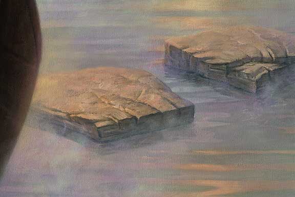 Stepping stones and softer final fog detail  Fog on green hills detail  The Tranquil Sea final 48" x 66" oil canvas Click to View PART ONE of the Tranquil Sea oil painting tutorial Visit Philip Howe's Website Tutorial is copyright of Philip Howe
|
||||||||||||||||
Oil Painting Lessons
Art Lessons |


